For my internship with Communities of Hope, I worked as an illustrator, creating visual covers based on written stories. Each project required me to carefully read and interpret the story to display its message in an image. This process pushed me to think beyond just aesthetics and focus on how visual elements can communicate emotion, tone, and meaning.
I have organized this page to display what I have created. I will go in-depth for the ones that I believe go above and beyond in terms of having such a deep connection.
Week 2: 1.24-1.30
In this illustration, I had a tree be the focus of environmental justice and the ongoing issues. I used a tree as the focus of the scale of justice. The left side represents the damage, and the right side represents the environment. The left side weighs more because the damage has been done so much, and the right side has started to crack and spill out, which represents the consequences of the damage. Through this piece, I explored how metaphor and visual tension can communicate the urgency of environmental justice in a direct symbolic way.
For this illustration, I focused on the Rhode Island Youth Justice Reform, which has an AI chatbot that supports incarcerated and foster care youth. I communicated this by having a computer open with an AI chatbot as the main focus and the opportunities with this program surrounding it. Through this piece, I explored how technology can be used as a form of support within the social service system and how design can help communicate that.
Week 3: 1.31-2.6
In this illustration, I focused on the prison-to-workforce program that provides green job opportunities. I communicated this through an open prison door with vines growing and wrapping around the cell structure. The open door was used to symbolize the opportunity, and the vines represent the green jobs. Through this piece, I explored how nature-based symbolism can communicate transformation.
This Illustration had me think a lot about the justice system and the community that is against it. I represented this by creating a split road with one way leading to the justice system, featuring a drawing of a courthouse, the weight of justice, and a gavel. The other path focuses on community support, illustrated through people holding hands and a hand being held out with a heart. This allowed me to separate the two ideas while still having them be connected. This project helped me think about symbolism and to communicate it.
Week 4: 2.7-2.13
This illustration was focused on a story about the Independent Living Program and the difficulties someone who has been in this program goes through. In this, it might just seem like someone moving and a new start, which it is, but I wanted to communicate the experience on a more emotional level. I added subtle visual details to represent this, such as a cloud and sparks behind the silhouette in the picture frames. Throughout the frames, these dark elements fade, but the small flicker of the light on the dresser remains as this dark element to show the past will always be there with them. This project had me think on a dark level of storytelling in a more subtle way, and it was such a strong turning point in how I started to think about representation.
“Mario’s Law” was a story that challenged me to approach an illustration with care and respect, as I wanted to represent the theme in a thoughtful and meaningful way. I spent time considering how to visually communicate a second chance and redemption. I eventually came up with the idea of a younger Mario in a jail cell, while his older self holds a hand out in support of offering him a second chance. This visual contrast allowed me to represent growth and accountability. I really focused on character placement and symbolism, and how they can be used to express time, change, and personal transformation.
This illustration focused on the incarceration and rehabilitation through green job opportunities. I showed this by having a pirson enviroment surrounded by fencing, with a small garden for these green jobs. I also experimented with a new technique for illustrating grass, which helped add texture and depth to the natural environment.
Week 5: 2.14-2.20
For this illustration, I did a simple classroom with computers to represent how classrooms are full of technology now, and there’s no more written work. Through this piece, I wanted to represent how technology is increasingly shaping both the environment and the learning process.
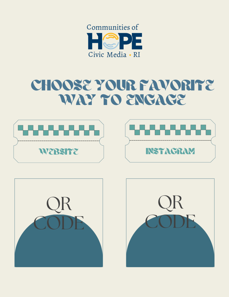
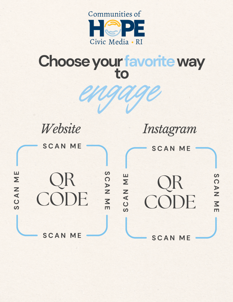
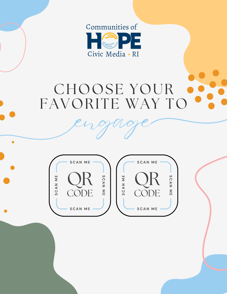

These four flyer concepts were designed to promote Communities of Hope and encourage engagement with the website and social media platforms. Each design was created differently but focused on capturing someone’s attention.
Week 6: 2.21-2.27
For this illustration, I created a hand wrapped with a breast cancer awareness ribbon to symbolize support. The hand represents care and protection. By combining these two, I communicated the importance of standing with individuals who are affected by breast cancer. Through this piece, I explored how minimal symbolism can still carry strong emotional meaning.
For this illustration, I created an outline of Maryland to represent the lawsuits connected to juvenile sexual abuse cases within the state. I communicated this by placing blue dots across the map to symbolize the widespread impact connected to the issues. By using a simplified outline, I was able to focus attention on the issue itself while maintianing a clear visual message. This project had me explore how informational and geographic symbolism can communicate serious topics in a concise way.
Week 7: 2.28-3.6
For this illustration, I wanted to show mental health struggles that many LGBTQ+ individuals may experience. To communicate this, I created a rainbow heart with scattered puzzle pieces. This symbolized emotional struggles and uncertainty. Through this project, I explored how simple symbolic imagery can communicate emotional complexity.
Week 7.5: 3.7-3.13
In this illustration, I wanted to showcase the atmosphere of midnight basketball games. To communicate this, I created an outdoor basketball court as a basketball is illuminated by moonlight while stars shine in the sky. Through this project, I explored how lighting and environment can create a mood and direct the viewer’s attention.
Week 8: 3.14-3.20
This illustration focuses on education and school performance, and addresses the decline in student attendance and academic engagement. To communicate this, I created a classroom with cracks along the walls to symbolize instability. I also included desks with each having a different amount of papers to represent the varying levels of student participation and struggles with completing schoolwork. These small details are for the viewers to look more closely and understand the underlying message. Through this project, I explored environmental storytelling and how subtle details can be put together to communicate issues.
For this illustration, I focused on representing the impact immigration issues can have on courthouses. I communicated this by illustrating a courthouse that is cracked and unstable, symbolizing the strain, conflict, and visible damage from these issues. By using the damage as a visual metaphor, I was able to represent the emotional impact without including more literal imagery. This project had me explore how architectural symbolism can communicate social and political themes in a direct but impactful way.
This illustration connects to the other “Garden Time” stories I have done, and this had me really think about how else I can portray this. Since my previous illustrations focused more on the garden environment, I decided to shift the attention towards the physical produce and hands-on aspect of gardening. To communicate this, I illustrated a person holding a bundle of carrots, which allowed for the produce to be the main focus. Through this project, I explored perspective and how small details can represent a concept.
This illustration focuses on “Ego,” which is an LGBTQIA+ dance club. For this, I created a simple dance club environment featuring elements such as a couch, a bar area, club lighting, and an LGBTQ+ flag displayed on the wall. I chose a minimal approach to place emphasis on the environment. Through this project, I explored how atmosphere and setting alone can communicate identity without focusing on characters.
This illustration was inspired by my “Independent Living Program” illustration, as both focused on experiences of foster care. While the other illustration focused on the adult part, this one focuses on the impact foster care has on children and the instability of constantly moving between places. I wanted to communicate this idea visually without directly showing a child, and so I placed a stuffed animal inside a moving box. It is a very small detail, but it has an important symbol behind it. Through this project, I explored how subtle objects can carry a deeper meaning.
This illustration focuses on the idea of “would you rather” by comparing traditional learning with online education. The concept focuses on the decisions students have regarding learning directly from teachers or through digital platforms. This project allowed me to explore visual comparison.
Week 9: 3.21-3.27
This illustration has a strong emotional focus that I wanted to communicate through facial expression. Unlike many of my other pieces, I chose an approach I had less experience with by focusing more on faces and emotion. I made this decision because I wanted the viewer to acknowledge the emotional impact immigration can have on children. I wanted this to have a personal connection rather than just symbolism. This project challenged me to step outside of my comfort zone and focus on facial emotion.
Week 10: 3.28-4.3
In this illustration, I focused on multiple aspects of campus life, including involvement on campus, hockey games, academics, spirit week, and the passing of a professor. Unlike many of my previous illustrations that focused on one topic, this piece had me think about layout, and spacing. Through this project, I explored multiple stories, and multiples ideas to create a single illustration while still maintaining clairty and emotional impact.
Week 11: 4.4-4.10
For this illustration, I created a simple timeline progression to represent the Data Reporting RI 2026 Child Welfare Plan. I chose a timeline structure because it clearly communicates the development and progression of long-term goals over time. The layout was to guide the viewer and inform them. This project had me think more about how layout and structure can support informational storytelling.
Week 12: 4.11-4.17
This illustration has an outline of Rhode Island with puzzle pieces colored: white, blue, yellow, and red. Representing mental health, laws, community action, and emergency response. I used the puzzle pieces to symbolize how these different systems and issues are interconnected and must work together to support communities effectively. This project had me think about how symbolism and color can organize multiple ideas within a single composition.
Week 13: 4.18-4.24
This illustration focuses on cybersecurity breaches and their impact on Rhode Island. I used a shield placed over the state, with visible cracks throughout it, which symbolizes the breakdown of protection. This project had me explore minimal imagery.
This illustration was created to represent the different ways people consume news. I focused on three main sources: TV, phones, and newspapers. Each represents a different way of delivering the news. TV displays live broadcasts, the phone focuses on social media and digital updates, and the newspaper represents traditional physical copy. I wanted to focus on how, though they’re all different in their own way, people still get the same information. This project had me think more about visual organization.
This illustration felt especially powerful to create because I wanted to represent the impact ICE has on the economy and the instability it can cause within communities. I communicated this through colorful stacked blocks that are cracked and close to collapsing, symbolizing the systems and people being affected. Through this piece, I explored how abstract forms and structural imbalance can communicate social and economic impact without relying on direct imagery.
Week 14: 4.24-5.1
For this illustration, I focused on SJN’s final show of the semester. I chose to do a newspaper layout with the middle newspaper having the headline saying, “SJN Signing Off For Now…” This was to attach the viewer’s attention to how it is the final broadcast for now. I was able to connect journalism and storytelling into this illustration while also having a transition included in it. This project had me think a lot about typography and layout.
In this illustration, I created a minimal room with a slightly open door, with a rainbow appearing and a silhouette walking towards it. I did this to represent LGBTQ+ identity, self-acceptance, and the journey of embracing who you are. The empty room symbolizes isolation, while the light symbolizes comfort. This piece had me think more about how symbolism can communicate personal growth and acceptance.
This illustration was inspired by my “Mario’s Law” Illustration. I wanted to keep the second chance and personal transformation. This time, it is shown for homelessness and new beginnings. I represented this through a silhouette facing the sun, which symbolizes hope and moving forward, while the shadow transforms into a tent to showcase the past experience of being homeless.
This illustration visually represents Heart Fest and its key elements of performance, artists, music, and education. I combined these aspects into a simple layout surrounding the word “Heart Fest.” I used a pink color palette to show a sense of energy and unity while still keeping everything together. I focused on creating a cohesive representation of the event rather than separating it.
Internship Takeaways
My role as an illustrator with CoH focused on turning real stories into visual pieces. A lot of what I did pushed me to think more about how the piece can represent meaning while using different themes, such as straightforward language, metaphors, and small details that communicate bigger things. I also had different topics represented, such as justice, education, mental health, identity, and community support.
One of the biggest things I learned was how to create something with emotional impact. I did this by using imagery such as trees, doors, classrooms, courthouses, puzzle pieces, and stuffed animals, while still keeping the real-life stories communicated.
As the internship went on, I noticed I covered a lot of topics that had also informed me about said things, such as foster care, incarceration, and youth support systems. I was even able to branch into other areas like environmental justice, education, LGBTQ+, and media. Working with all of these topics helped me see different social issues and how they can be connected through similar visual methods.
This experience helped to push me to try things I wasn’t comfortable with. I experienced drawing faces and showing emotion, I drew bodies, I drew things I wasn’t used to, and this opened a door for me to want to continue and improve.
Overall, this internship helped me grow into an illustrator, at first I wasn’t sure if I was made out for this because I had never really done it before, but this helped me think more about design and what I want to do. I learned how illustration can be used to communicate real issues through visual and emotional means, and that small details can completely change the meaning of a piece.