Edibile Book Fest
I will be showing my process of coming along and creating my project for the 2025 Edible Book Fest. I will be showing my ups and downs, twist and turns of how I tested many techniques to find the right one.
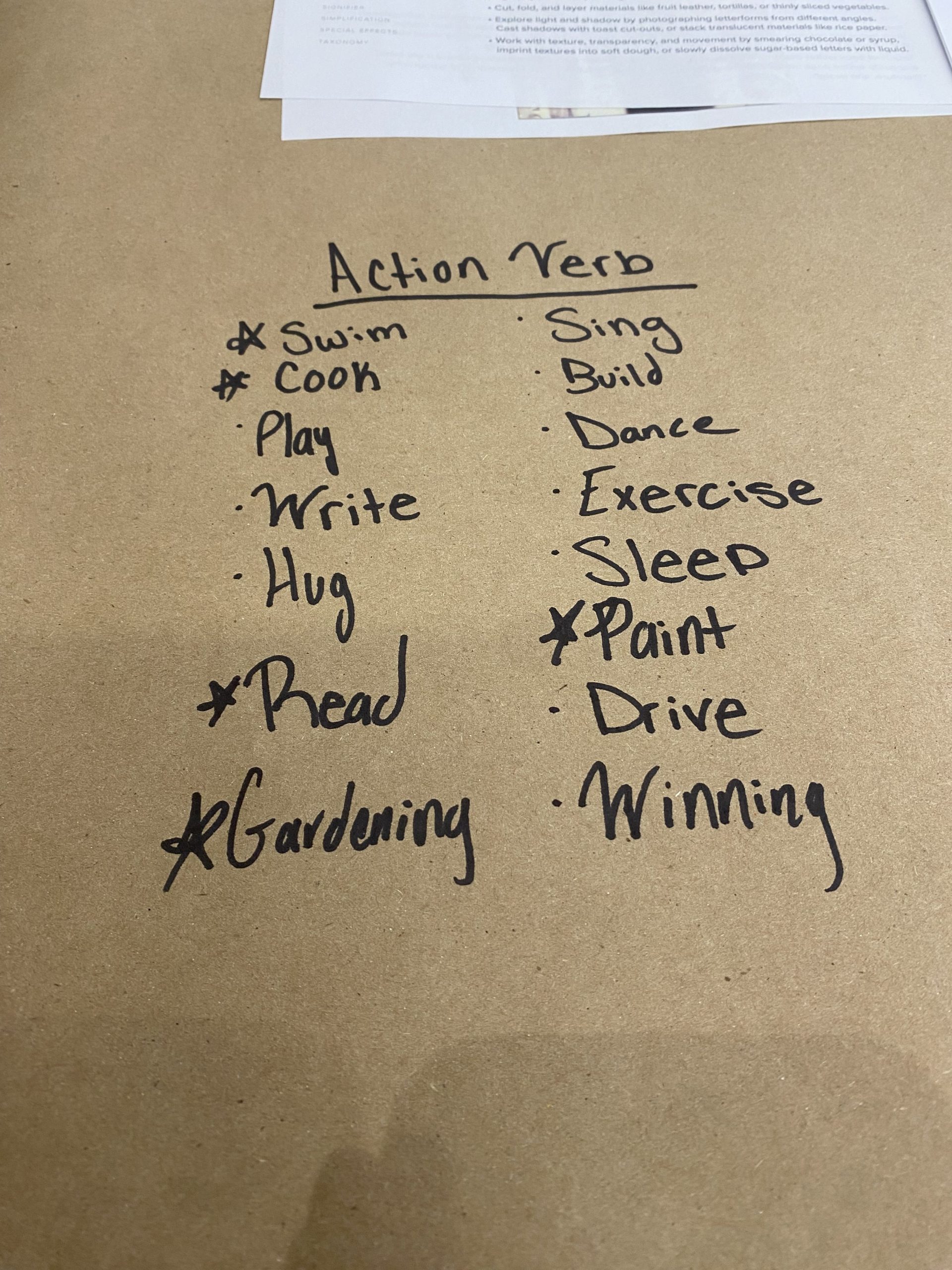
For my first step, I had to choose a word. I had many in mind and I was originally going to do “read.”
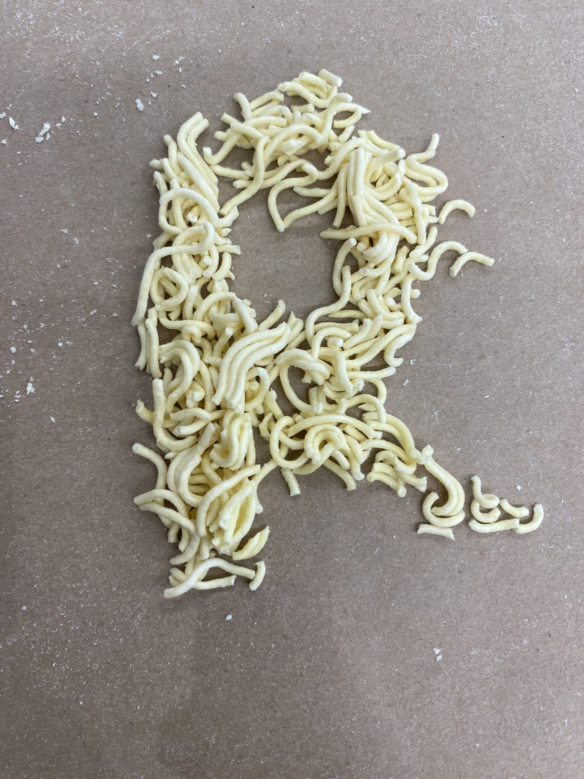
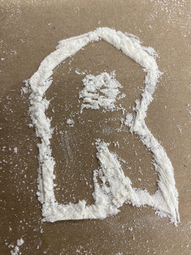
I then started to experiment in class with the letter “R”
I then tested it at home.
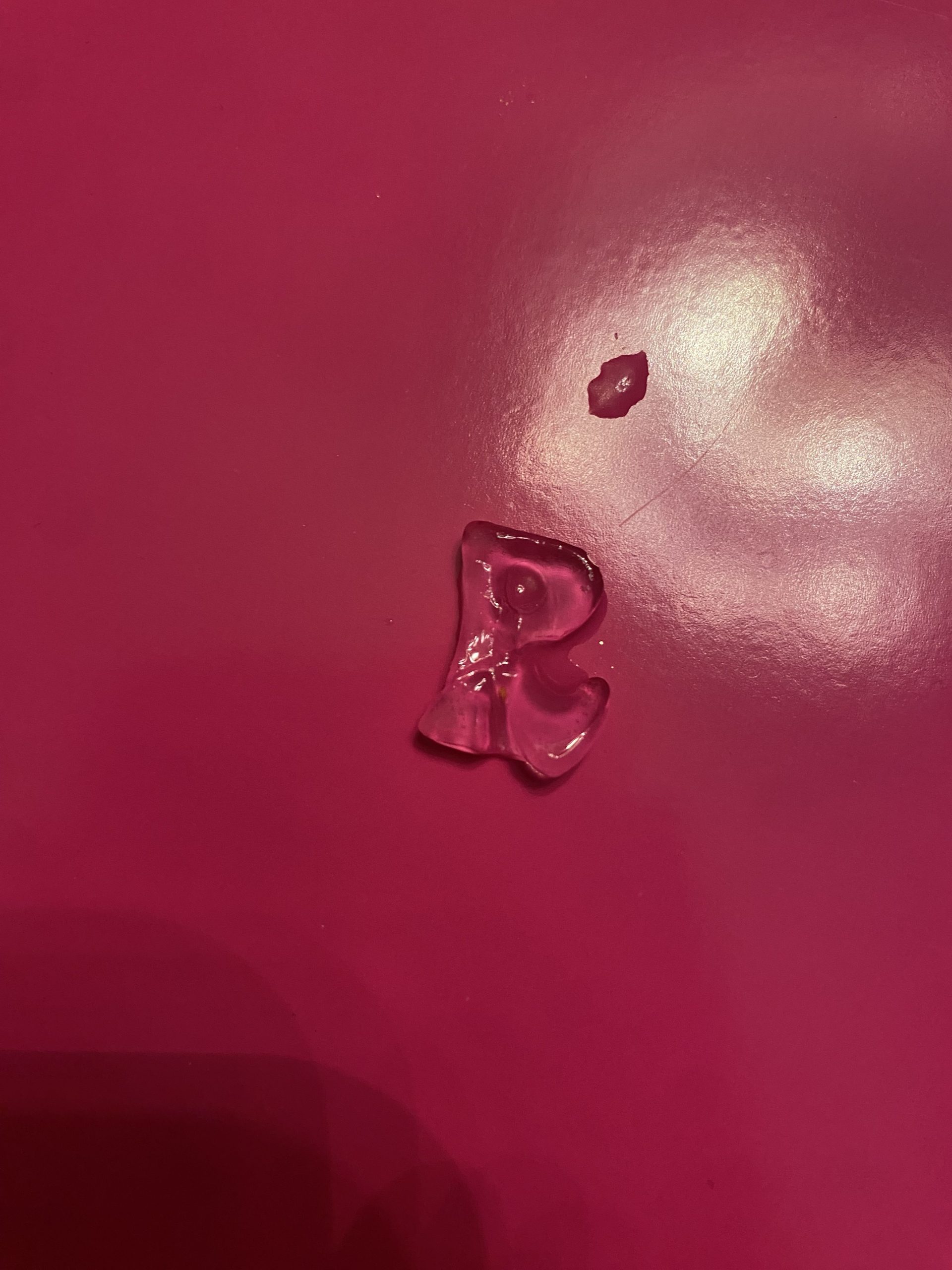
I used an ice mold and had the letter melting.
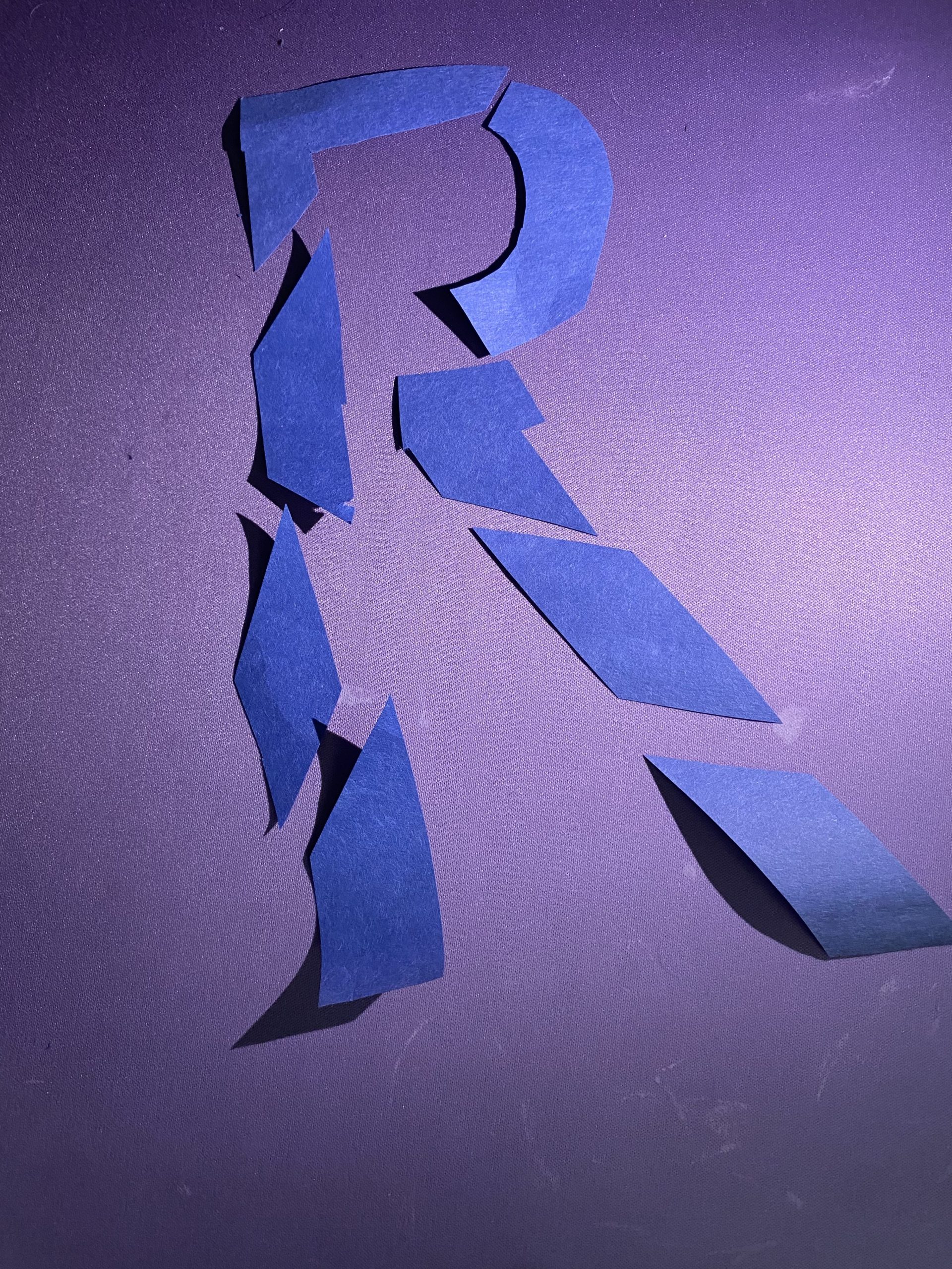
I also had the letter broken apart using paper.
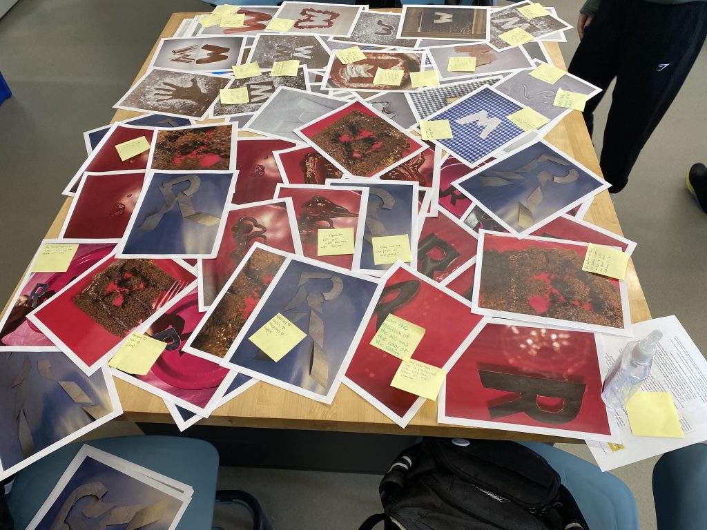
I then received feedback on the letter process.

For the next step I chose a book and for the word I will focus on is “Love”
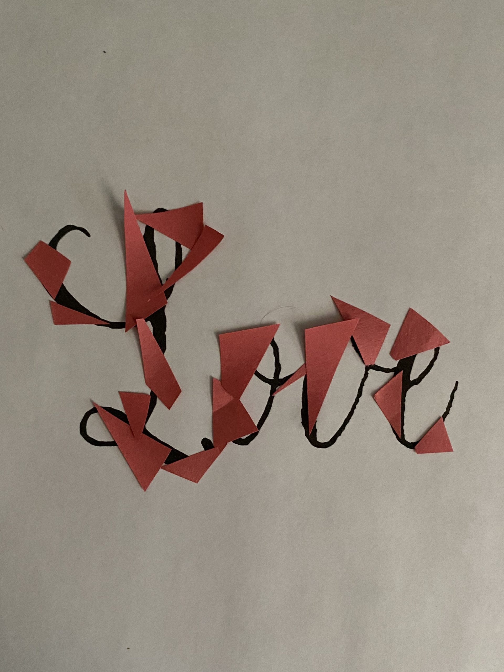
I then started to experiment with the word. I then realized it would be not easy to use this technique since many of the letters are covered.

I then came up with another idea and first tested it in photoshop to see how it would look.

I then put my idea into photoshop and now it was time to make it.
I then changed my mind, again.
![The Fever Code [Book]](https://m.media-amazon.com/images/I/91EZk3EsfyL.jpg)
I first came up with this design as the front cover

But of course, I changed it, again.
I wanted something that felt more like the original book with the buildings.

I then put it all together and this what I came up with.

This project definitely had its ups and downs, but I finally came up with a design I actually liked!
Daily Spark
Everyday of the semester I was tasked with creating a daily design that takes 5 minutes, for mine I put together mood board
Social Good
For this project, we will be focusing on how images are a powerful communication tool.
All found on: Adbusters
SHOCK

This image has to do with shock because alcohol can affect someone’s mind and make them hang, as it says. This is a shock to me simply because it implies someone hanging.
FACT

The meaning behind this image and the saying “The product is you” means that when you use a free platform, it is technically not free. The company is selling your attention and data to advertisers as their product. This is a fact to me because it is true, not everything is free, and your data is important to companies.
IRONY

The meaning behind this image is simply that some people believe they need to wear makeup to not be ugly. Makeup sellers are the “they” mentioned and are trying to get people to cover their faces in makeup. This is ironic to me because even when people agree with this, they still buy it.
EMOTION

This image is trying to showcase how McDonald’s and fast food in general can make you die. This is emotional to me because it makes people realize that fast food can cause health problems.
INSTRUCTION

This image is trying to get people to get out of technology. It is saying that all people do is be in a fantasy world of technology. This is instruction to me because it is telling people to escape.
CODING

This is another image that has to do with how people consume all of these stores, shows, fast food, etc… This is coding to me because it is in society for taking in all of this.
My project
For my project, I am interested in a few ideas, one of which I will be starting with is the consumption of technology.
- My first idea is someone staring into a phone with a swirl coming out and also being in the eyes, while in the background, fun activities are in the background.
This photo will symbolize the missing out on life because of always looking at your phone.
- My second idea involves someone staring at a TV and playing video games; it is based on the same concept as the first idea.
This photo will also symbolize the missing out on life because of playing video games.
Text ideas:
- “You’re focusing on the wrong thing.”
- “You’re not here.”
- “This isn’t right.”
- “Stop being consumed and focus on reality.”
- “You’re missing out on life.”
- “You’re wasting time.”
- “You’re going to miss out on life.”
- “Are you having fun?”
- “At least you’re having fun, right?”
Text I am going with:
- “You’re wasting time.” – Fact (This is a direct statement about the perceived use of someone’s time.)
- “You’re focusing on the wrong thing.” – Instruct (This offers guidance, suggesting a different direction.)
- “At least you’re having fun, right?” – Irony (The tone often implies the speaker doubts the activity is truly enjoyable or worthwhile.)
- “You’re going to miss out on life.” – Emotion (This statement plays on feelings of FOMO and potential regret.)
Original Design:

Print files:


Reso Prints:


Reflection:
Receiving feedback from my peers gave me valuable insight into others’ perspectives. My peers gave back feedback saying how the no eyes make the phone stand out and show the girl being blind to the world around her. I also received feedback that the clock font makes it stand out more. This feedback was beneficial and helped because it showed what I wanted to be shown. Originally, I wanted to add eyes, but I didn’t know how to draw them well and just left it blank. When it was pointed out how it is showing that message of being blind to the world, that made me happy that I was able to show the message I wanted.
I labeled my work as “detail-oriented, impactful, symbolism, vocal.” My peers expressed how it is vocal by speaking out, and how the phone is symbolizing how impactful a phone can be. It was expressed that detail-oriented doesn’t stand out, and how there could be more that is shown. We did agree that I showed a lot of detail in the girl, but I am unsure what else I could do to add more detail. I originally wanted something happening in the background but decided not to so maybe that is what I could have done.